Colour invites rather than intimidates.
Warm orange creates an energetic visual reference. Paper and coffee tones bring it into the world of everyday materials.
Good coffee.
Closer to people.
Concept project · Self-initiated · 2026
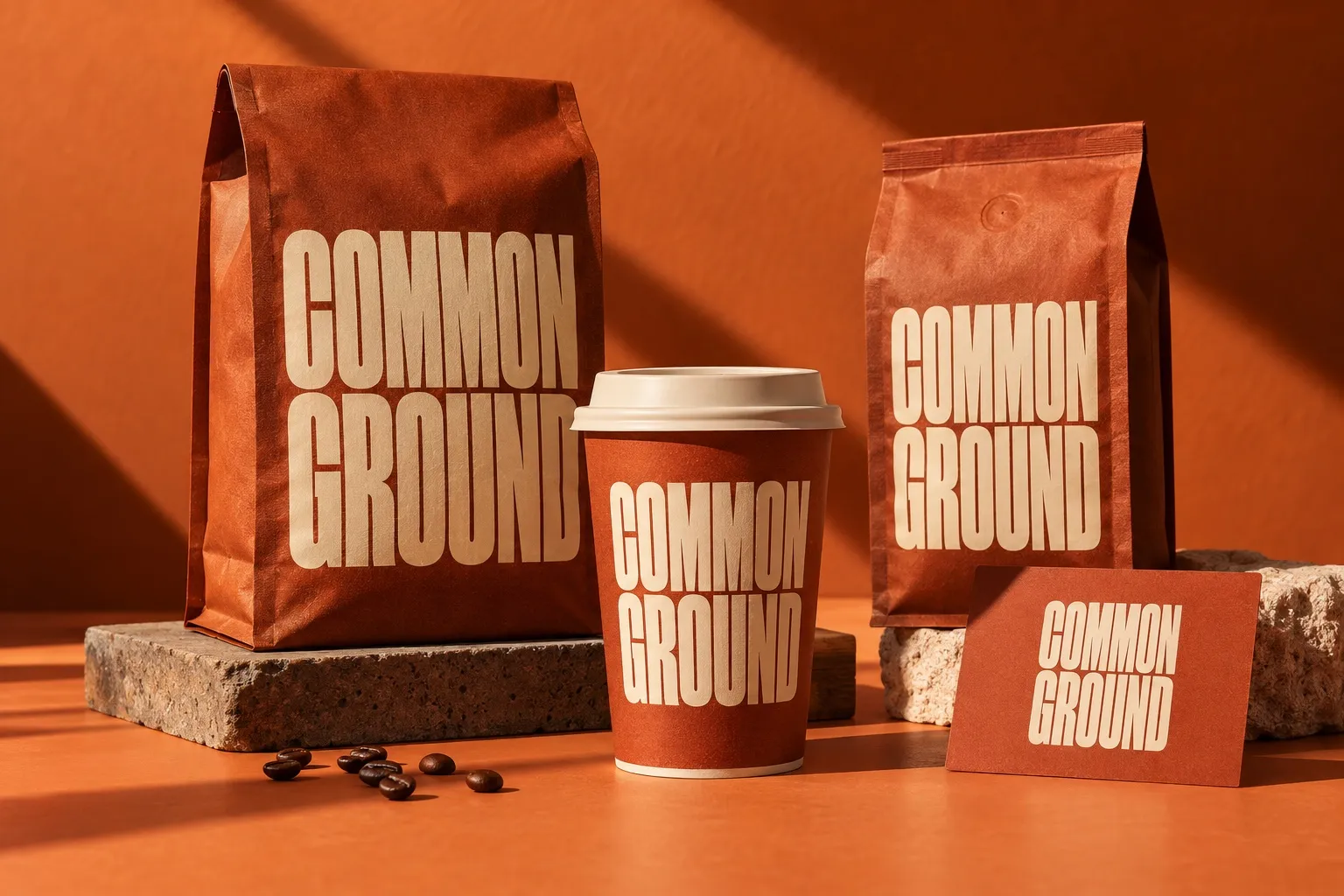
AI-generated concept visualization. These are not materials produced for a client.
Common Ground is a fictional specialty coffee brand. The exercise starts with a tension: can care for product quality be expressed without distant or exclusive language?
Imagine a welcoming brand with character, making room for coffee enthusiasts and people finding their morning ritual alike. This is an audience hypothesis, not a research finding.
The proposed direction brings together quality coffee and human connection. Its visual expression should feel warm, direct and easy to recognise.
Orange, warm paper and expressive typography give the identity a familiar tone. A system that moves naturally from packaging to cups and into conversation.
Good coffee.
Good morning.
Warm orange creates an energetic visual reference. Paper and coffee tones bring it into the world of everyday materials.
A simple, direct voice leaves room for conversation. Quality is expressed without jargon that makes the product harder to understand.
Visually substantial lettering supports recognition on packaging and cups. The composition makes space for useful product information.
The exploration follows the identity through simple moments of meeting the product: choosing a bag of coffee, taking a cup to go and reading materials in the café.
A concept showing how approachability can become a design principle, from tone of voice to colour and objects. The applications illustrate a direction without claiming a real launch or commercial performance.
This is a self-initiated demonstration. It does not include real customer research, commercial implementation or measured results.
